RP- Spatial Accessibility of COVID-19 Healthcare Resources in Illinois
Reproduction of: Rapidly measuring spatial accessibility of COVID-19 healthcare resources: a case study of Illinois, USA
Original study by Kang, J. Y., A. Michels, F. Lyu, Shaohua Wang, N. Agbodo, V. L. Freeman, and Shaowen Wang. 2020. Rapidly measuring spatial accessibility of COVID-19 healthcare resources: a case study of Illinois, USA. International Journal of Health Geographics 19 (1):1–17. DOI:10.1186/s12942-020-00229-x.
Reproduction Author: Evan Killion
Reproduction Materials Available at: RP-Kang Repository
Created: 26 May 2021
Revised: 26 May 2021
Introduction
The original study, conducted by Kang et al (2020) attempted to rapidly quantify access to COVID-related healthcare - namely ICU beds and ventilators - in Illinois for those at risk (defined as those over 50) and actual COVID-19 patients. Their analysis was centered around a two-step floating cathcment area method, in which multiple levels of catchment were created, overlaps between them and base units (here tessellated hexagons) were mapped, and weights applied to quantify those areas with high access and low access to hospitals based on distance and resources, not dissimilar from the gravity model of spatial interaction explored earlier in the semester. The COVID-19 pandemic has revealed stark disparities in healthcare access - especially as they concern race - and this and similar projects aim to bring to greater light to such disparities in a time of national crisis.
Materials and Methods
This replication study utilized the data sources and Jupyter notebook with Python code kindly provided by Kang et al, available here. These were hosted on the CyberGISX platform out of the University of Illinois.
To conduct these analyses, data was queried from a number of sources:
- OpenStreetMap road data was queried using Python’s
OSMNXpackage - Population data was taken from the 2018 American Community Survey
- Hospital data was collected from the Department of Homeland Security’s Homeland Infrastructure Foundation-Level Data forum
- Finally, COVID data was obtained from the Illinois Department of Public Health
As noted earlier, this study utilized a two-step floating catchment area method, measuring distance between zip-code centroids and hospitals based on a network analysis and using this to help determine access. Additionally, the number of ICU beds and ventilators - important metrics given the severe nature of the respiratory disease caused by the SARS-COV2 virus - was taken into account in determining this.
Input files were first loaded in and API’s were queried where necessary to obtain data, and then such inputs were preprocessed; certain isolated roads with no outlets needed to be removed from the road network, and hospitals needed to be “moved” to the nearest network node for analysis. After this, catchment areas within 10, 20, and 30 minutes were created based off of network analyses with convex hulls. Accessibility was then figured based off of the weights of the different catchment area distances, the resources available at nearby hospitals, and then these were added when a hexagon was within the catchment areas of multiple hospitals.
Broadly, this replication follows the code in the original Jupyter notebook, but some changes were made to account for some “errors” in the original study. Unfortunately, the Kang et al’s study included hospitals outside the city limits of Chicago within a certain radius in their analysis, but the road network used remained limited to Chicago city limits. Thus, via code used later in the analysis, hospitals outside of chicago were relocated to their nearest network node within the boundaries of Chicago, potentially making some hospitals artificially accessible (e.g. a hospital 15 minutes outside of Chicago would be counted as on the city limit). This replication broadened the road network, querying all roads within 30km of Chicago from OpenStreetMap. Additionally, the color ramp used in visualizing access was changed from one ranging from very light to dark red (which usually carries negative connotations, especially in a health setting, thus unsuitable for symbolizing high access to healthcare) to one ranging from light pink to dar purple.
Results
The final repository for this reproduction can be found here
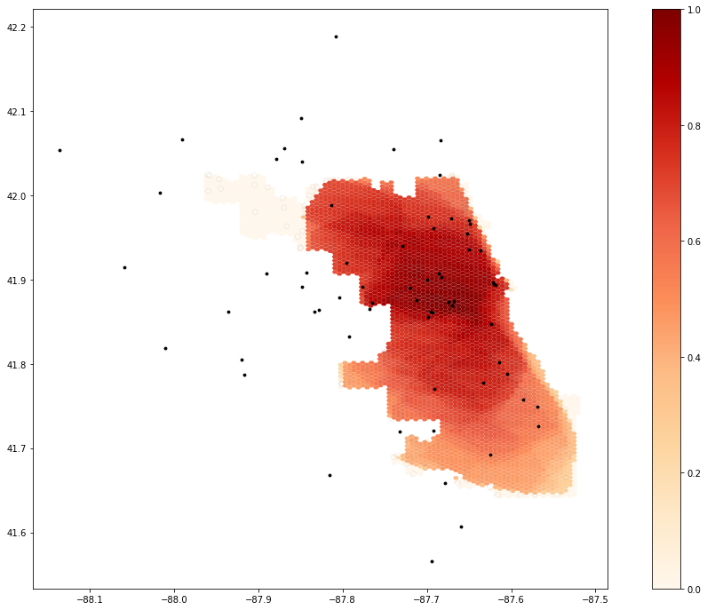 Map 1. Output from original code
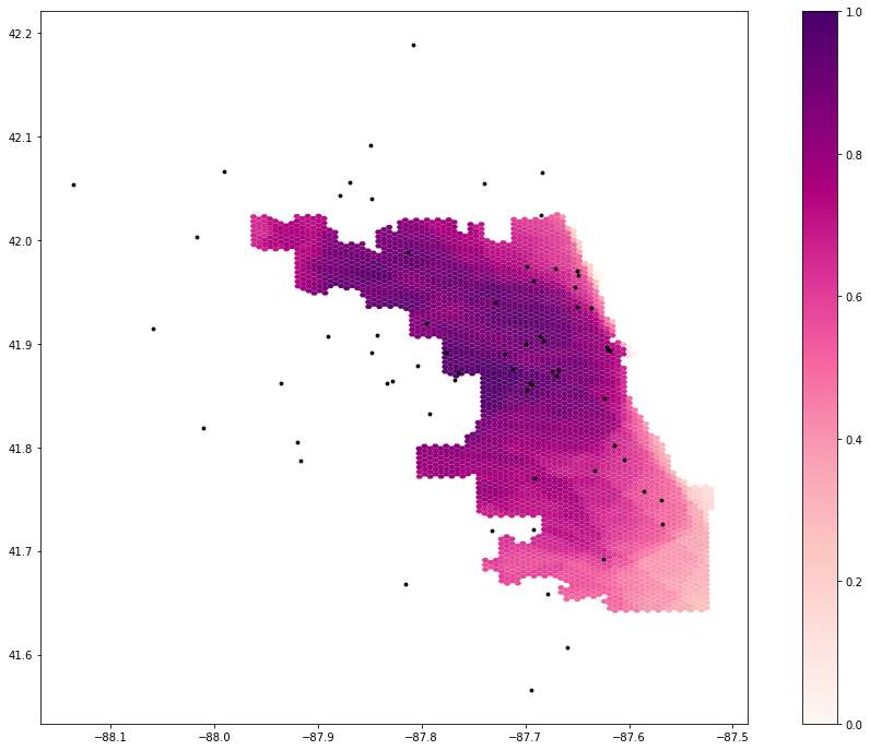 Map 2. Output from edited code
Immediately apparent from both maps is a general abundance of healthcare in central areas of Chicago, and low access to care in the Southeast of the city, a predominately Black region. However, when comparing the two, some interesting patterns emerge. In the first map, using the constrained road network, the northwest of the city has almost zero access to healthcare. When including a wider network of roads, however, this area becomes a region with moderate or even high access to healthcare, not surprising given the array of hospitals in surrounding areas.
One somewhat glaring error in this analysis, however, is how access and distance themselves were measured. Like any other large city (and even many smaller ones), a significant amount of Chicago residents are transit users and pedestrian commuters, either by choice or necessity, and the choice of a very auto-centric model for “access” seems inappropriate given that this analysis is studying a city with significant pockets lacking car ownership.
Additionally, while certainly a useful the metric, many of us working on replicating this analysis found it somewhat odd that the “at-risk population” was defined as just those over 50. Age is certainly a factor which makes people particularly vulnerable to COVID, but given differential effects of the COVID pandemic on those of different races, ethnicities, and socio-economic classes, I would advocate a re-evaluation and broadening of this definition, even if it may add some complexity to this analysis.
Conclusions
This analysis was broadly successful in replicating the results of Kang et al’s study, as well as building upon it ourselves to further fine-tune the methods used and results produced. In providing their code and data sources so openly, the authors have made it significantly easier to export their model to other locations, and the tweaks made by myself and others to this analysis would have been much harder to implement if such code was not available. This is an incredibly valuable contribution to the field of open source geoscience, and as a open source technique which builds upon ideas similar to the gravity model of spatial interaction, is useful as we continue to evaluate disparities in access to healthcare in this country, especially in light of the incredibly deadly pandemic affecting us now and recent reckonings surrounding institutional and structural racism.
Some quick acknowledgments!
A special thanks to Maja Cannavo for helping to fix issues in processing the road network for analysis, to Drew An-Pham for some templates for this report, for Joe Holler in leading us through this course, and Kang et al for making this study so widely available!
References
Kang, J. Y., A. Michels, F. Lyu, Shaohua Wang, N. Agbodo, V. L. Freeman, and Shaowen Wang. 2020. Rapidly measuring spatial accessibility of COVID-19 healthcare resources: a case study of Illinois, USA. International Journal of Health Geographics 19 (1):1–17. DOI:10.1186/s12942-020-00229-x.
 This work is licensed under a Creative Commons Attribution-NonCommercial-ShareAlike 4.0 International License.